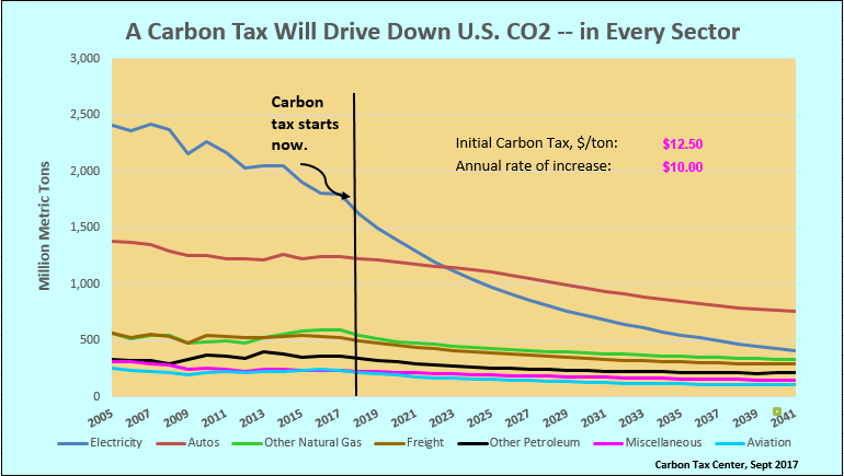
We’ve just posted the 2017 update to the Carbon Tax Center’s spreadsheet model of U.S. CO2 emissions. That’s our powerful but easy-to-use tool for predicting future emissions and revenues from possible U.S. carbon taxes. The model, which runs in Excel, accepts any carbon tax trajectory you feed it and spits out estimated economy-wide emission reductions and revenue generation, year by year.
 Here’s what’s new:
1. A year of new data: The most obvious update is that we’ve incorporated 2016 baseline data on energy use, CO2 emissions and emission intensity into each of the model’s seven sectors.
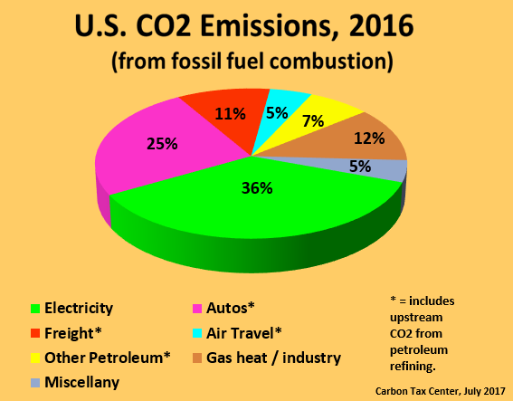
2. Oil refining is now allocated to usage sectors: Last year we pulled oil refinery emissions out of “Other Petroleum Products” and into its own category, which accounted for an estimated 6.4% of U.S. CO2 emissions in 2015. We’ve now taken the logical next step and allocated those emissions into the economic sectors that require refining crude into product in the first place: autos (principally gasoline), freight (largely diesel), air travel (jet fuel) and the catch-all “other petroleum” encompassing home heating oil, propane, kerosene and residual oil used by industry. The lion’s share of Refineries’ 6.4% slice of CO2 emissions is now within autos; not only is gasoline by far the largest-volume petroleum product, it also consumes the most energy per unit among the major petroleum products. Although our model is again down to seven sectors, from eight, the change promises a more accurate prediction process by tying demand more closely to emissions.
3. Slimmed-down graphics: We’ve weeded out extraneous graphics so you can focus on what’s key: comparing emission reductions between the Climate Leadership Council’s carbon tax, a carbon tax pegged to the “social cost of carbon,” and future emissions absent carbon pricing. Other graphics break down emissions by sector (see graphic above), depict reductions in oil consumption and show carbon-tax revenues nationally and by household. Most importantly, you can input your own starting tax level and growth path and see how fast (or slowly) emissions fall. That’s still done in the spreadsheet’s “Summary” tab, which we’ve cleaned up to make it easier to navigate.
And don’t overlook these two features we added in 2015:

Our familiar pie chart now assigns refinery emissions to end-use sectors.
1. Smoothing the uptake of the carbon tax: The model now captures lags in households’ and businesses’ adaptation to more-expensive fossil fuels. You, the user, set the adaptation “ceiling” rate; the model automatically carries over any excess to future years. This feature is helpful for trajectories like the Whitehouse-Schatz bill, which kicks off with a bang at $45 per metric ton of carbon dioxide but then rises only slowly. Under our default setting, in which the economy in any year is assumed to be able to process only tax increments up to $12.50 per ton of CO2, the reductions from that initial $45/ton charge are spread over four years rather than, unrealistically, assigned to the first year.
2. Demand impacts vs. Supply side impacts: At the bottom of the Summary page is a new section comparing the projected CO2 reductions from changes in fuels’ carbon intensities (“supply side”) versus reductions from reduced energy usage (“demand side,” e.g., lower electricity purchases, less driving or flying). Under our default carbon tax — the one proposed by former Rep. Jim McDermott — an estimated 58% of projected CO2 reductions are on the supply side (i.e., due to decarbonization); a large minority, 42%, come about through reduced demand, illustrating that subsidies-only policies miss out on huge CO2 reductions. Indeed, clean-energy subsidies undercut decarbonization by stimulating energy usage through lowered energy prices, as we pointed out in our 2014 comments to the Senate Finance Committee.
Please download the spreadsheet — here’s the link again — and run it in Excel. See for yourself the relative efficacy of a carbon tax trajectory that increases by a fixed amount each year, as does the McDermott tax, vs. one like Whitehouse-Schatz that starts high but rises only by small, percentage-driven amounts. See also how much more quickly emissions decline under these and most other carbon tax scenarios, compared to the emission reductions from the Obama administration’s Clean Power Plan.
As you work (play?) with the model, jot down your thoughts so you can tell us what works and what needs improving. Especially the latter, as we just wrapped the update an hour ago and there are bound to be glitches. Thanks.
